Measuring the Invisible
LUMINA's visual identity reflects our mission: observing and understanding the night environment. Our color palette evokes the night sky (noir), scientific data (teal), and space innovation (launch purple). Our typography balances technical precision with accessibility, creating a brand that is both scientific and approachable.
Colors
Brand color palette
Typography
Font families & styles
Layout
Spacing & elements
Tone of Voice
Writing guidelines
Logo
Logo assets & guidelines
Mission Patch
Official mission patch
AI Brand Prompt
Working with AI agents like Claude or ChatGPT? Click below to copy a comprehensive brand prompt to your clipboard. Paste it into your AI conversation to ensure all generated content matches LUMINA's brand guidelines - colors, typography, tone of voice, and more.
Brand Colors
Click any color to copy its hex code to your clipboard.
Core Colors
Noir
#061626
Primary dark color
Ivory
#E4D5B7
Light text & accents
Teal
#3CCFC9
Primary accent color
Launch
#9D8FFF
Secondary accent
Secondary Colors
NeoNoir
#1A2F4A
Cards & backgrounds
Grey
#9CA3AF
Text & outlines
Semantic Colors
Red
#E65A6B
Error states
Amber
#FFA500
Warning states
Blue
#4BA6E8
Info states
Green
#57C47E
Success states
Event Colors
Astro
#9D8FFF
Nautical
#51C8F0
Civil
#F069E5
Solar
#E4D5B7
Moon
#FFFFFF
Golden Hour
#F28C28
Blue Hour
#4BA6E8
Brand Fonts
LUMINA typography works across web, presentations, documents, and print materials.
Title Headings
Web: Space Grotesk • Print/Documents: Cascadia Code
Usage
- • Page titles and hero headings
- • Presentation title slides
- • Document covers
- • Large display text
Specifications
- • Size: 36-72pt (presentations), 48-96pt (web)
- • Weight: SemiBold (600) or Bold (700)
- • Color: White on dark backgrounds
- • Alternative: Arial Black, Impact (if unavailable)
Section Headings
All Media: Calibri • Universal heading font
Usage
- • Section titles
- • Card headings
- • Slide headings
- • Navigation elements
Specifications
- • Size: 18-32pt (presentations), 20-40pt (web)
- • Weight: Bold for headings, Regular for UI
- • Color: Noir on light bg, Ivory on dark bg
- • Alternative: Arial, Helvetica (if unavailable)
Body Text
All Media: Segoe UI (Light for web, Regular for print)
Artificial light at night is one of the fastest-growing environmental pressures, yet it remains poorly measured. LUMINA fills this gap with scientifically rigorous monitoring of the UK night environment.
Usage
- • Paragraphs and body content
- • Descriptions and captions
- • Presentation body text
- • Document content
Specifications
- • Size: 11-14pt (documents), 16-18pt (web)
- • Weight: Light (300) for web, Regular (400) for print
- • Line height: 1.5-1.6 for readability
- • Alternative: Helvetica, Arial (if unavailable)
Text Color & Emphasis
Flexible guidelines that prioritize visual clarity while maintaining brand consistency.
Default Text Colors
- White backgrounds: Noir text (#061626)
- Noir/dark backgrounds: White text (#FFFFFF)
- Simple, high-contrast defaults for readability
Emphasis Colors
Usage Guidelines
Example: Section titles on web often use Teal for visual appeal, even without science connection
Principle: Semantic meaning guides color choice, but clarity always wins
- • Never use italics for emphasis
- • Use bold + color for impact
- • Emphasize selectively (words/short phrases)
- • Visual hierarchy matters most
Design Elements
Consistent spacing, buttons, and interactive elements create a cohesive LUMINA experience.
Spacing System
Section Padding
- • Mobile: 4rem (64px) top/bottom
- • Desktop: 5rem (80px) top/bottom
- • Horizontal: 1-2rem responsive
- • Use class: py-16 sm:py-20
Content Spacing
- • Cards/Elements: 2-3rem (32-48px) gap
- • Between sections: 3-4rem (48-64px)
- • Card padding: 1.5-2rem (24-32px)
- • Use classes: gap-6, gap-8, p-6, p-8
Text Spacing
- • Paragraph spacing: 1rem (16px)
- • Heading margins: 1.5-2rem below
- • Line height: 1.5-1.6 for body text
- • Use classes: space-y-4, mb-6, leading-relaxed
Buttons
All buttons use rounded-full style with consistent padding (px-8 py-2) and Calibri font.
Primary Button
Default: Teal bg + Noir text + Teal border
Hover: Noir bg + Teal text + Teal border
Effect: Color inversion (150ms)
Use for: Main calls-to-action, commit actions
Secondary Button
Default: White bg + Grey text + Grey border
Hover: Grey bg + White text + Grey border
Effect: Color inversion (150ms)
Use for: Secondary actions, navigation
Tertiary Button
Default: Launch bg + White text + Launch border
Hover: Noir bg + Launch text + Launch border
Effect: Color inversion (150ms)
Use for: Specialty actions, unique emphasis
Cards & Containers
Standard Card
- • Background: NeoNoir (#1A2F4A) or White
- • Border radius: rounded-lg (8px)
- • Padding: p-4 to p-8 (16-32px)
- • Shadow: shadow-md or shadow-lg
- • Use class: lumina-card
Content Containers
- • Max-width: max-w-4xl or max-w-7xl
- • Center with: mx-auto
- • Responsive padding: px-4 sm:px-6 lg:px-8
- • Background alternation: white/gray-50 sections
Icons
- • Style: Outline/stroke-based (never filled)
- • Stroke width: 2px consistent
- • Standard sizes: w-4 h-4, w-5 h-5, w-6 h-6
- • Color: Inherit from parent text color
- • Use: Heroicons or similar outline icon sets
- • Spacing: mr-2 or ml-2 next to text
Interactive States
- • Hover: Scale (scale-105) or color change
- • Transition: transition-all duration-200
- • Focus: Outline with teal color
- • Links: Use teal color with hover effect
- • Cursor: cursor-pointer for clickable elements
Tone of Voice
LUMINA's voice balances scientific credibility with accessibility and a even subtle touch of dry wit for imapct. We are authoritative but approachable, precise but plain, earnest but self-aware.
Core Principles
Authoritative but Approachable
We know our stuff, but we're not lecturing from an ivory tower.
Precise but Plain
Technical when necessary, clear always.
Earnest but Self-Aware
We care deeply, but we know we're just humans pointing instruments at the sky.
Warmth Without Sentimentality
We're human and relatable, but we don't oversell the emotion.
A Gentle Guide
We invite people in rather than shout at them.
Impactful
Subtle observations with clear, meaningful implications.
Do / Don't
Do
- Use measured confidence
- Cite real measurements or locations where possible
- Ground claims in data and evidence
- Use precise, specific language
Don't
- Use dramatic language ("crisis", "catastrophic") without data
- Anthropomorphise the system excessively
- Make unsubstantiated claims
- Overstate or sensationalise findings
We treat environmental data as a public good: transparent, reproducible, and responsibly shared.
LUMINA's commitment to open science and data ethics underpins everything we do.
LUMINA Logo
The LUMINA wordmark should always appear on Noir or NeoNoir backgrounds. It can be used standalone or with the tagline lockup below.
Light Usage Mapping in Nighttime Atmosphere
Vector format • Scalable • Ivory color (#E4D5B7)
Logo Usage Guidelines
Background
- • Always use Noir (#061626) or NeoNoir (#1A2F4A)
- • Never use on white or light backgrounds
- • Avoid busy or patterned backgrounds
- • Ensure sufficient contrast
Sizing & Spacing
- • Minimum height: 48px for web, 20mm for print
- • Clear space: 0.5× logo height on all sides
- • Scale proportionally only
- • Center on backgrounds when possible
Tagline Lockup
- • Tagline: "Light Usage Mapping in Nighttime Atmosphere"
- • Font: Inter, weight 300 (light), white
- • Size: 0.15–0.20× logo height
- • Spacing: minimal spacing between logo and tagline
Do
- • Use the official SVG file
- • Maintain logo integrity
- • Use on dark backgrounds only
- • Preserve clear space
- • Keep colors as specified (Ivory)
Don't
- • Don't use on light backgrounds
- • Don't change colors or opacity
- • Don't add effects, shadows, or outlines
- • Don't distort, rotate, or skew
- • Don't place on photographs
LUMINA Mission Patch
The official mission patch symbolizes LUMINA's commitment to measuring and protecting the night environment.
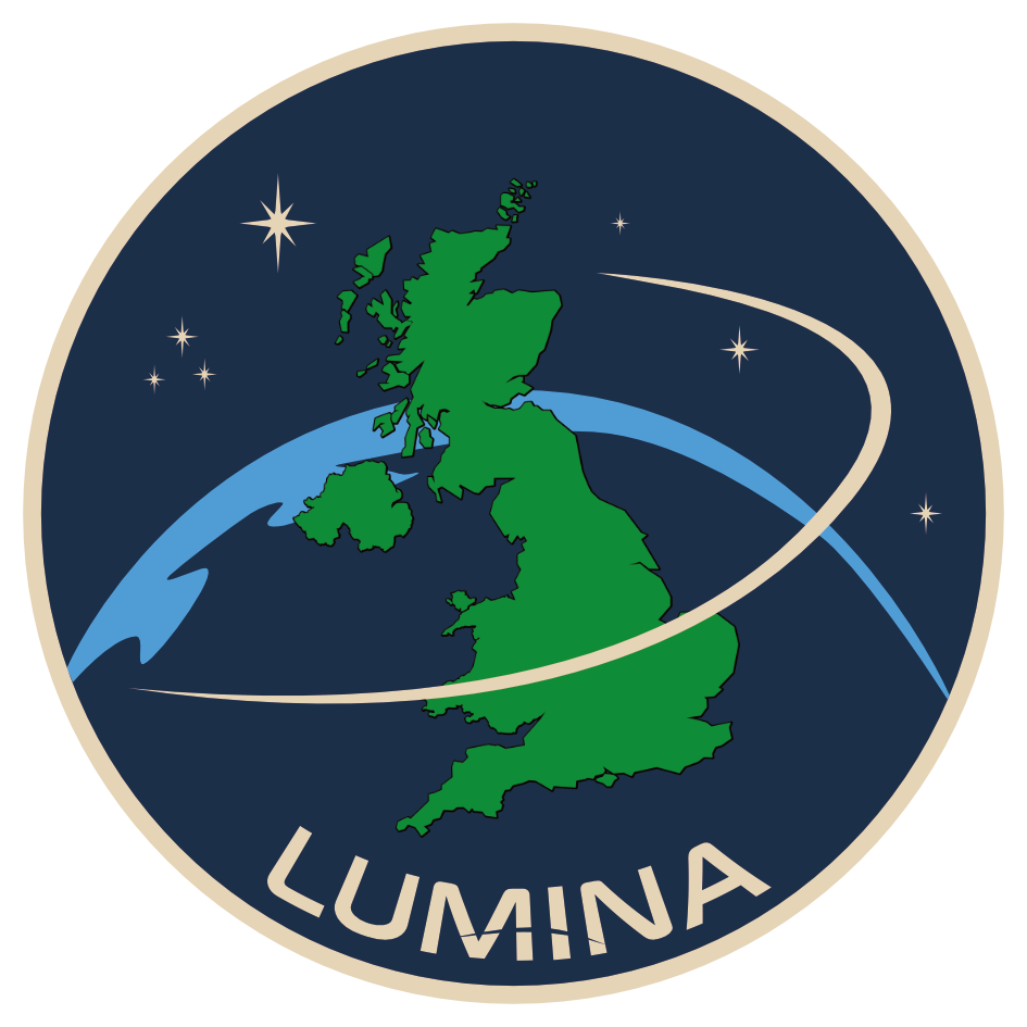
High resolution • 1024x1024px
Patch Symbolism
The LUMINA mission patch embodies our core mission: to observe, measure, and protect the night environment through scientific innovation.
Usage Guidelines:
- Official communications and presentations
- Educational materials and outreach
- Merchandise and promotional items
- Partner organization materials (with permission)
Do not modify, crop, or alter the patch design.
Questions About Usage?
If you have questions about using LUMINA brand assets or need high-resolution versions, please get in touch.